Delivering the wow factor
When Respond were approached in 2018 to work on a renovation in Takapuna, their initial instructions were simply to ‘make the house look good’. Architect Mark Gribble talks about how they achieved the brief while delivering a more functional space that fitted the client’s lifestyle.
Living in the Hawkes Bay, the owner of this beachside property had recently purchased it to use as a base when in Auckland.
“The client was primarily intending to use the house to entertain friends,” explains Mark. “He was looking for that ‘wow factor’ when it came to the home’s appearance, but he also had a list of features he didn’t like that he wasn’t sure what to do about. When I took all of this into consideration, I offered him some layout options that would make a huge difference to both how the house looked and how it functioned.”
One of the main issues was the existing home’s lack of privacy. Situated in a prime position near Takapuna Beach, the master bedroom was very exposed to the road below.
“The bedroom had the best views of the sea and Rangitoto Island, but the client had to keep the curtains closed for privacy reasons. I suggested moving the master bedroom and turning it into an upstairs lounge/entertainment space and bar area. To achieve this, we removed a superfluous fourth bedroom and turned an office into a more modern space that could be closed away when not in use. The client really liked this ‘multi-use’ approach to the spaces.”
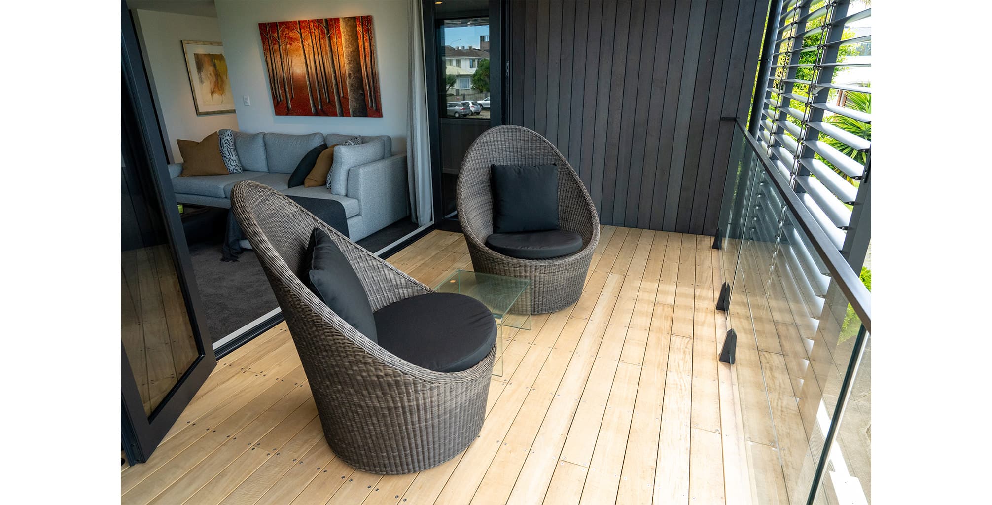
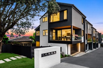
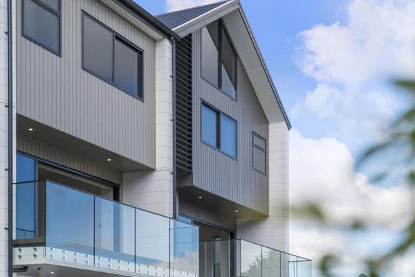
To maintain privacy for the new lounge, Mark suggested dividing the huge upstairs deck in two and fully enclosing it.
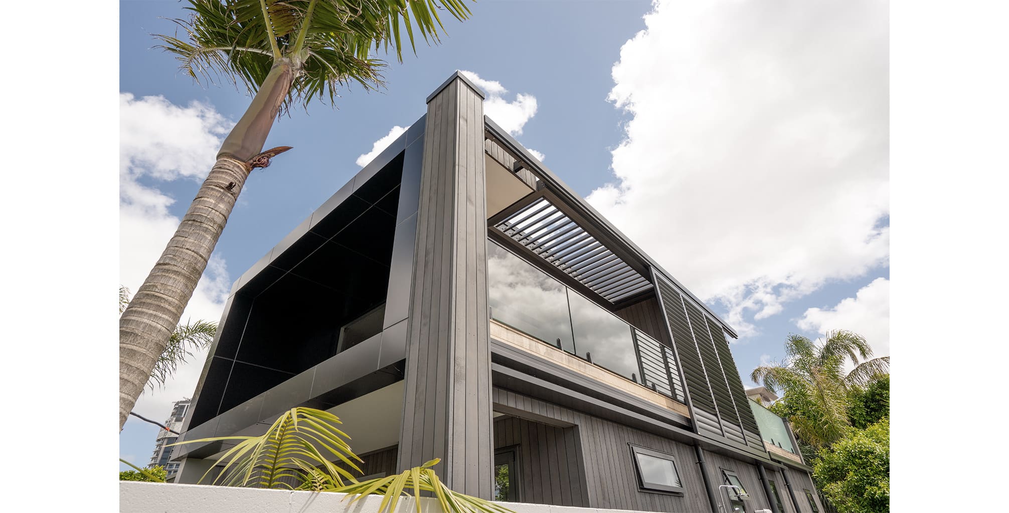
“By designing a fully enclosed deck off the lounge, we achieved both privacy and protection from the elements. The addition of louvres means the client can now open up the lounge windows, rather than having to keep them closed all the time.”
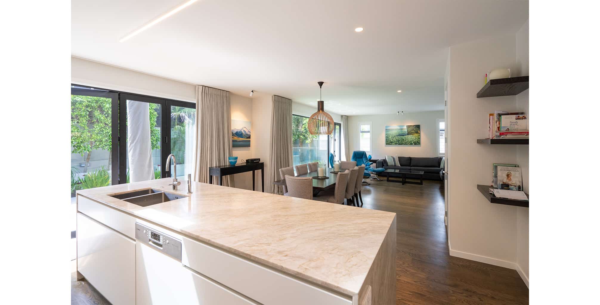
Another issue with the existing house was the lack of light in the lower level. Mark resolved this by opening up the downstairs area and adding a new open stairwell to let light through.
“We created a central stairwell with a huge skylight above, which brought light downstairs and made it feel more open. We also changed what was previously three different rooms into one big lounge/entertainment area. The Prendos engineering team were heavily involved in this, as the supporting beams needed to be re-established in order to achieve the open plan look.
“Again, we took a multi-use approach to the space, removing a toilet (previously in the middle of the area) and giving the downstairs bedroom an ensuite that also had a public access – so it doubled as a guest bathroom. The resulting layout gives the client options: if the weather is great he can entertain downstairs next to the pool, or he has a more private lounge upstairs.”
The swimming pool, which butted directly up against the house, was another concern for the owner, who was worried it may cause damage to the property.
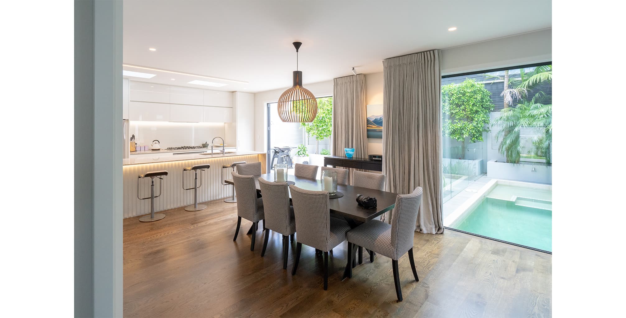
“We took the existing pool and really focused on the level of detailing around it – splashbacks and reinforcement etc – to ensure there were no problems with the house or with getting council consent. We took advantage of the pool’s position and installed a huge window in the downstairs lounge overlooking it – letting more light into the building and really making a feature of the pool.”
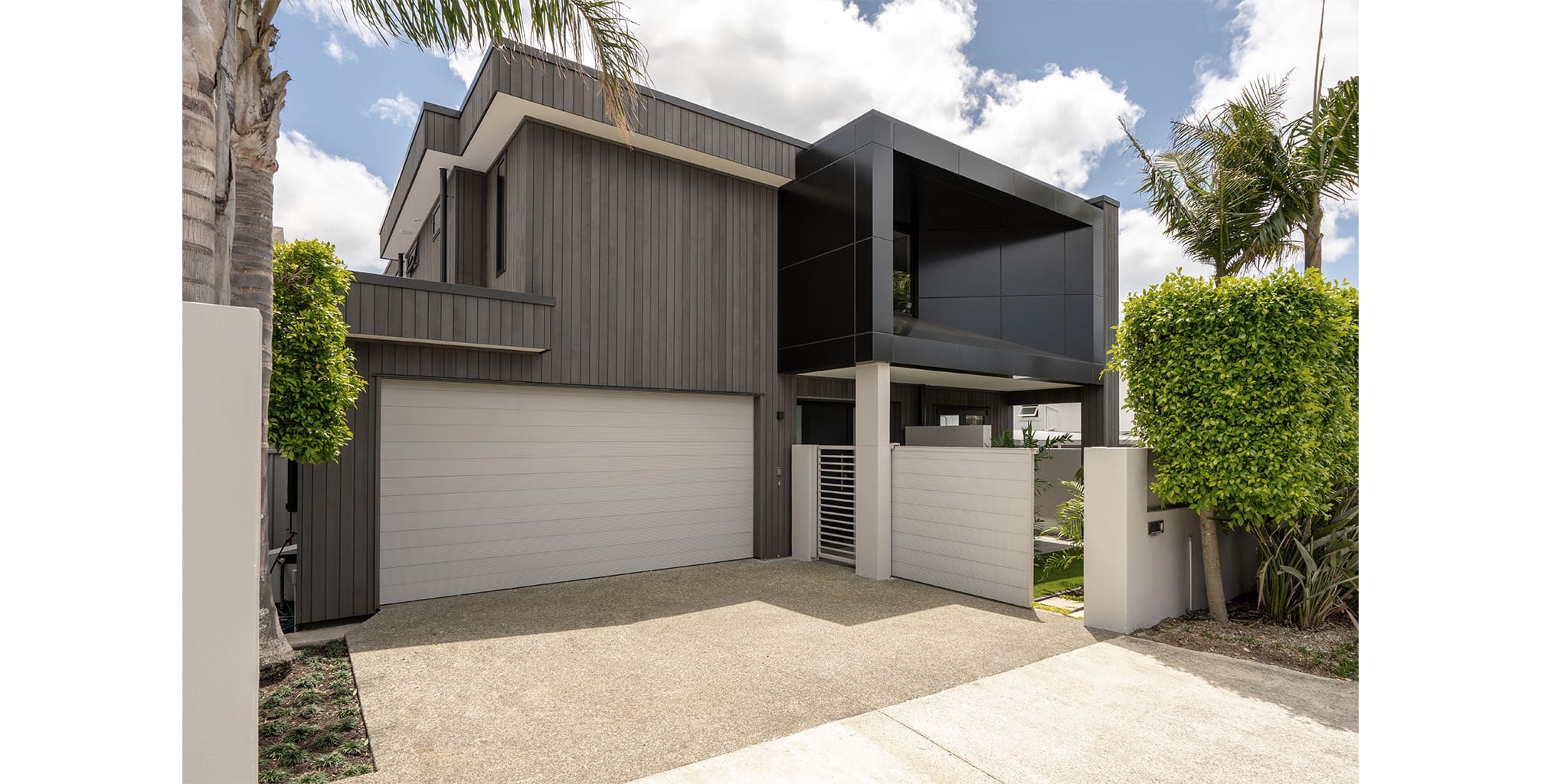
When it comes to aesthetics, a carefully designed upper level extrusion is certainly a standout feature of the new home.
“The extrusion is purely a decorative element, designed to give the client that wow factor he was looking for,” says Mark. “It’s turned what was previously a flat, dead space into a point of difference. We designed it so that from inside the house it’s virtually imperceptible – you come upstairs and you see the deck, you don’t even notice the extrusion. Yet from the outside it’s a real feature.”
With close neighbours and a visible street frontage, light and window placement throughout the house was also important. Through the use of virtual reality, Respond was able to walk the client through the layout, show him the view from the new spaces and where the light would fall throughout the day.
“Once we started showing him the design in 3D, he really got it. We could take into consideration the movement of the sun path, the views and the need for privacy. Because the building is east facing, it was clear that after lunchtime we needed light to be coming in from another direction – which is where the louvres and skylights are important.”
Thanks to their experience in dealing with local councils, Respond was able to take over this side of things for the client, drawing on the skills of the wider Prendos team to assist.
“The new design actually had a number of potential infringements which we were able to work with council to overcome. Probably one of the biggest things was gaining resource consent. We walked the council through what we were doing onsite and were able to get them on board, which saved the client a huge amount of stress. We also worked closely with Prendos engineers to solve structural issues, which meant we could provide solid solutions to the council and give the client a full picture of what each design option would mean time and cost wise.”
Overall, Mark and the team have delivered a home that fits the client’s lifestyle and ticks all the boxes when it comes to visual appeal.
“The project’s success came down to understanding what the client wanted and how he would be living in the house. There were a lot of things about the old design that seemed to have been put there as ‘fillers’, whereas now every space is functional and the layout really makes sense.
“The resulting home is a complete contrast to what it was before: the covered deck, the decorative extrusion, the use of stained cedar and the high-quality choice of materials. We’ve delivered the wow factor, upgraded the overall appearance of the property while solving the issues the client had with the house: light, privacy and general layout and flow.”


